Founded during the 1940s in California by brothers-in-law Burt Baskin and Irv Robbins, Baskin-Robbins is a world renowned ice cream franchise with headquarters in Canton, Massachusetts.
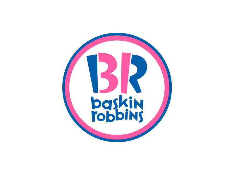
The company’s logo has only changed a couple of times since it was originally created and the version being used today was designed in 2007.
The colour pink in the logo not only features as part of the letters BR (the first letter of each of the founders’ last names), but also displays the number 31, representing the original and famous 31 flavours concept of Baskin-Robbins, which proposed that you could enjoy a different flavour of ice cream on each day of the month.
Pink is also the colour of the little spoon that customers can use to sample all the flavours before buying.
Looking for a new logo or a re-design of an existing one? By all means, have a look at our portfolio or get in touch.