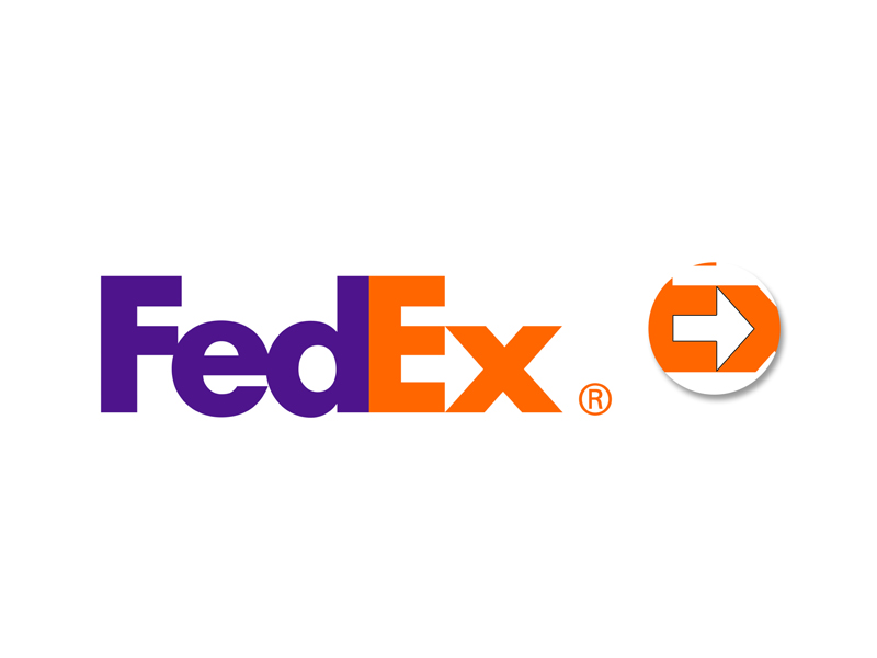
The FedEx company was founded in 1971 as a packaging delivery startup. Over several decades, it has developed into a powerful logistics brand and trend setter. The company’s award-winning logo became one of the main factors behind its success.
The FedEx logo is mostly known for its tricky optical illusion. If you look closely between letters E and X, you’ll spot a white arrow. It stands for speed, accuracy, strive for perfection, and perseverance in achieving goals.
The design has won over 40 awards and was ranked as one of the eight best logos in the last 35 years by Rolling Stone magazine.
Looking for a new logo or a re-design of an existing one? By all means, have a look at our portfolio or get in touch.

