Jagged edges on Elementor shape divider
Shape dividers are a nice feature in Elementor allowing you to create some very interesting effects in terms of page design. Recent versions of Elementor are suffering from an issue related to shape dividers where very noticeable jagged edges are visible on the edges of the actual shape. At the time of writing this post, […]
FX-PM Shop Launch
FX-PM is delighted to announce the launch of its on-line shop featuring the exclusive range of Organix Anonymous 100% certified organic cotton t-shirts, produced responsibly and printed on-demand using biodegradable inks. Extra comfortable and an absolute joy to wear, featuring unique, original and exclusive minimalist designs that will put a smile on your face. All […]
Verdana
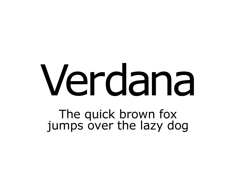
This rather controversial typeface was originally created for Microsoft by Matthew Carter and Tom Rickner, primarily to be readable at small sizes on low-resolution monitor screens. Since 1996 it has been included in all versions of Windows, Office and Internet Explorer. Up until 2014, PayPal’s logo was based on Verdana. Verdana’s primary reputation as a […]
Tour de France
The Tour de France was established in 1903 and is the most prestigious cycling race in the world. The event has never missed a year except during the two World Wars. Since its inception, the logo of the race has gone through several changes. The current logo was created in 2002 by French designer, Joel […]
Frutiger
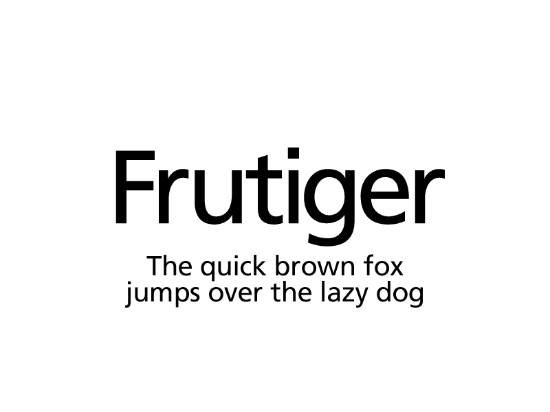
Frutiger was created by Swiss type designer Adrian Frutiger after being commissioned in 1968 to implement a new directional sign system for the newly built Charles de Gaulle international airport in Roissy, France. The typeface, originally called Roissy, was completed in 1975 and installed at the airport the same year. Frutiger has been used extensively […]
Subway
The history of Subway starts in 1965 when Fred DeLuca and Peter Buck joined forces to open a sandwich shop called Pete’s Super Submarines in Bridgeport, Connecticut. In 1968 the two men changed the name of their restaurant chain to Subway and since then the franchise has grown into the hugely successful business that it […]
Futura
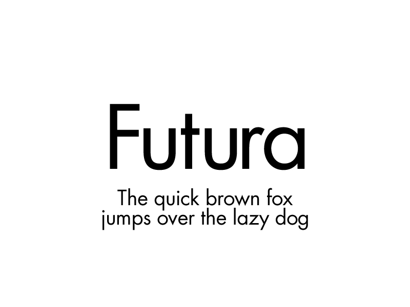
An iconic typeface which was originally created by German typographer Paul Renner in 1927. Throughout the years, Futura has made appearances everywhere from Nazi propaganda to fashion and automotive brands. It was even the first font to go to the Moon during the Apollo 11 mission. Featuring a great range of weights and styles, Futura […]
Baskin-Robbins
Founded during the 1940s in California by brothers-in-law Burt Baskin and Irv Robbins, Baskin-Robbins is a world renowned ice cream franchise with headquarters in Canton, Massachusetts. The company’s logo has only changed a couple of times since it was originally created and the version being used today was designed in 2007. The colour pink in […]
Gill Sans
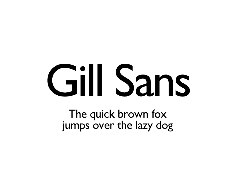
This quintessentially English font was produced by Monotype Corporation and designed by Eric Gill in 1928. Gill worked with Edward Johnston, designer of the Johnston Font which was used for the London Underground and is often confused for Gill Sans. You may recognise Gill Sans from the BBC logo where it started being used in […]
Amazon

The first version of the Amazon logo was originally designed in 1995 by Turner Duckworth. The latest variation we all know today was created in 2000 and further refined in 2012. The Amazon smile is just as famous as the logo itself and has resulted in the company being associated with delivering “smiles” to the […]
